In the world of logo design, simplicity is often the key to success. One of the most effective ways to achieve simplicity while still creating a memorable and impactful logo is through geometric logos. Geometric shapes, with their clean lines and sharp angles, are powerful tools that can communicate a brand’s message with clarity and precision.
But what makes geometric logos so effective? Why do simple shapes like circles, squares, and triangles resonate so strongly with audiences? In this article, we’ll explore the power of geometric logos, how they contribute to brand identity, and why so many successful companies have turned to basic shapes to represent their brands.
What Are Geometric Logos?
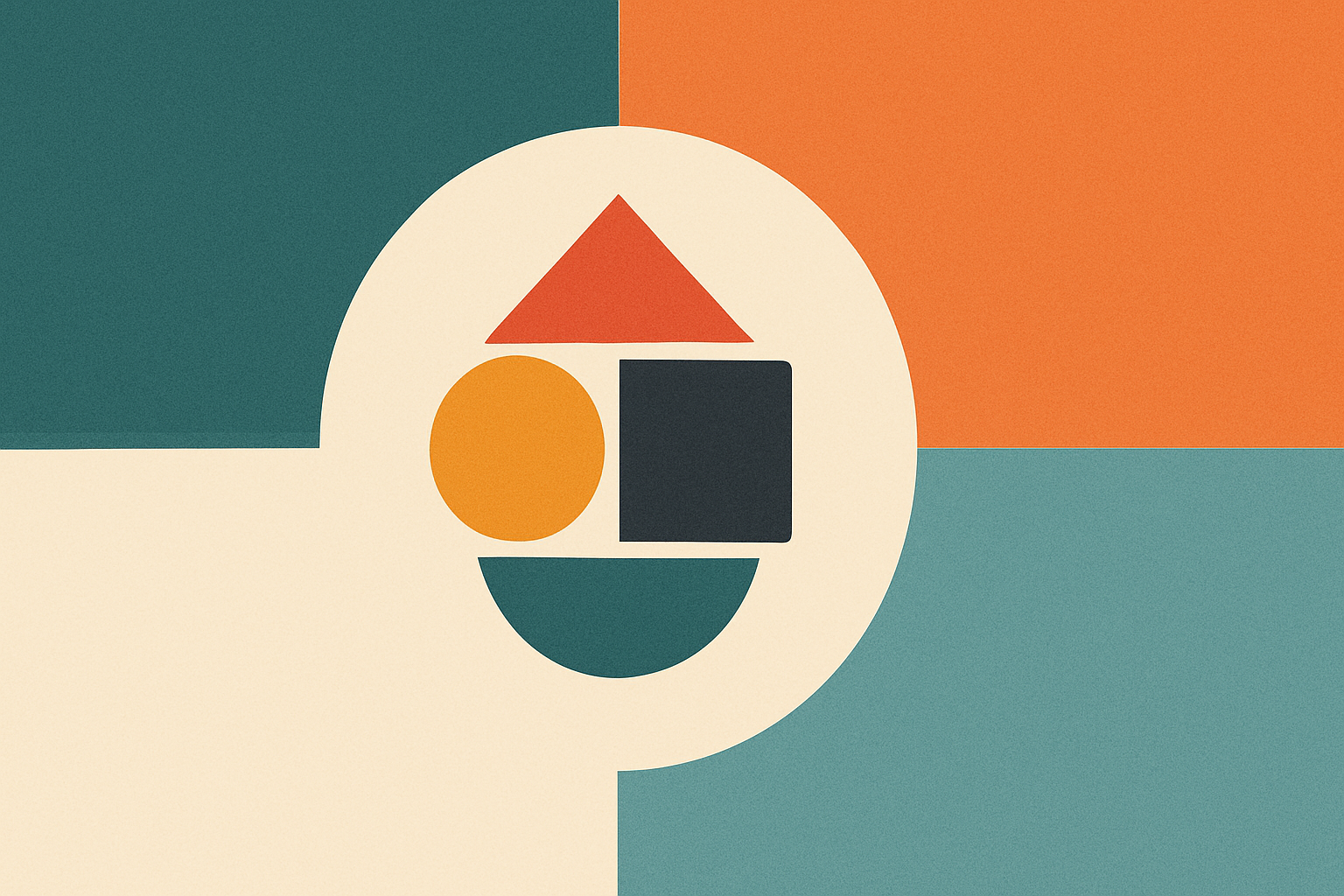
Geometric logos are logos that are built around simple, clear, and recognizable shapes like circles, squares, triangles, and polygons. These logos rely on the use of basic geometric forms to convey a brand’s identity and message.
For example, the BMW logo uses a circular design, while the Adidas logo incorporates three simple stripes. Both of these logos are instantly recognizable and communicate their respective brands without the need for additional complexity.

Geometric logos are often chosen for their minimalism, precision, and balance. These logos are clean and visually satisfying, making them effective tools for brand recognition.
Why Geometric Logos Work: The Power of Simplicity
At first glance, geometric logos may seem overly simple, but there is real power behind their simplicity. Here are some key reasons why geometric shapes work so well in logo design:
1. Clarity and Legibility
One of the primary benefits of geometric logos is their clarity. Geometric shapes are straightforward and easy to understand, making them highly legible. Logos with simple shapes can be scaled down or up without losing their clarity, which is particularly important for digital applications, such as social media profiles or app icons. With tools like Turbologo, you can easily create clean, geometric logos that remain sharp and effective at any size.
A circle, for instance, is a shape that works well at any size and on any background. This ensures that your logo is visible and recognizable, whether it’s printed on a billboard or displayed on a small mobile screen.
2. Memorability
Simplicity often leads to memorability. Think of iconic logos like Nike’s Swoosh, Apple’s apple, or Microsoft’s four colored squares. These geometric logos are etched into our minds because of their simplicity. The more straightforward a design is, the easier it is for consumers to recall.
The simplicity of geometric logos allows them to be easily identified at a glance. This helps your brand stand out in crowded markets, creating a strong visual identity that sticks with consumers long after they’ve seen it.
3. Timelessness
In design, trends come and go, but geometric shapes remain timeless. They are not subject to passing fads or changing tastes, which is why so many successful brands have opted for geometric logos. These logos transcend time and trends, staying relevant for decades.
For instance, Toyota’s logo features overlapping ovals, creating a balanced, timeless design. The use of geometric shapes gives it a clean, modern aesthetic that remains fresh, no matter how the design world evolves.
4. Versatility
Geometric logos are incredibly versatile. Their clean lines and simple forms allow them to work across a wide range of platforms, mediums, and formats. Whether your logo appears on a website, a product package, or a business card, a geometric design will maintain its integrity.
Simple geometric logos also allow for easy adaptation across different colors and variations. For example, Pepsi’s logo has gone through several iterations over the years, but it has always retained the core geometric elements—spheres, circles, and lines—that make it instantly recognizable.

5. Symbolic Meaning
Geometric shapes can carry deep symbolic meanings, which is why they are often used to represent abstract ideas like strength, balance, and stability. Each shape can evoke a different set of associations in the mind of the viewer:
- Circles represent unity, infinity, and wholeness. They can symbolize continuity, global reach, and inclusivity. Brands like BMW and Target effectively use circles to evoke these qualities.
- Squares and rectangles convey stability, reliability, and structure. Microsoft and Google both use rectangular shapes in their logos to reflect their foundational, dependable nature.
- Triangles often represent power, direction, and ambition. The sharp edges and angles of a triangle suggest forward movement and growth. Companies like Adobe and Delta Airlines use triangles to convey their dynamic and ambitious character.
By choosing the right geometric shape, a brand can subtly communicate its values and mission, creating a stronger emotional connection with its audience.
Examples of Iconic Geometric Logos
Some of the most iconic and successful brands have used geometric logos to create strong, lasting identities. Let’s look at a few examples:
Nike – The Swoosh

Nike’s Swoosh is one of the most recognized logos in the world. The simplicity of the design—a single, fluid curve—speaks to movement, speed, and energy. It’s a geometric symbol that represents the brand’s focus on performance and athleticism, and it’s one of the most powerful examples of how simplicity can create a lasting impact.
Apple – The Apple Icon

Apple’s logo, a simple apple with a bite taken out, is another example of geometric design done right. The roundness of the apple, paired with the clean, smooth lines, reflects the company’s focus on simplicity, elegance, and innovation. The iconic apple shape is universal and immediately recognizable, making it one of the most valuable logos in the world.
Adidas – The Three Stripes
Adidas uses a geometric design in its three-stripe logo. The clean, parallel lines represent the brand’s minimalist approach and convey a sense of speed and motion. This simple yet bold design has made Adidas one of the most recognizable names in sports apparel.
Toyota – The Overlapping Ovals

Toyota’s logo features three overlapping ovals, which form a sleek and balanced design. The geometric shapes symbolize the brand’s commitment to innovation, reliability, and customer satisfaction. The simplicity and symmetry of the design make it instantly recognizable and timeless.
Designing Your Own Geometric Logo: Tips and Best Practices
If you’re considering creating a geometric logo for your brand, there are a few key principles to keep in mind:
1. Start with Simplicity
The best geometric logos are built on simplicity. Avoid unnecessary details or intricate patterns that can distract from the core message. Focus on a single, powerful shape that encapsulates your brand’s values and message.
2. Consider Your Brand’s Message
Different geometric shapes communicate different values. Think about the message you want to convey through your logo and choose shapes that align with your brand’s identity. Do you want to communicate stability (squares), movement (triangles), or unity (circles)?
3. Prioritize Versatility
Ensure that your geometric logo works across different mediums and sizes. A good logo should look just as strong on a business card as it does on a billboard or a mobile app icon.
4. Play with Color and Negative Space
Geometric logos are often more powerful when paired with the right color scheme. Colors can add depth and emotion to the design, while negative space can enhance the simplicity and impact of the logo.
5. Test for Scalability
Make sure your logo remains clear and impactful when resized. A geometric logo should be able to work at any size, from a tiny app icon to a large banner.
Conclusion: The Lasting Impact of Geometric Logos
Geometric logos are more than just a design trend—they’re a powerful tool for building a strong, memorable brand identity. Their simplicity, clarity, and versatility make them effective in a variety of contexts, from mobile apps to billboards. By harnessing the power of basic shapes, brands can communicate their values and create lasting connections with their audience.
As you consider the future of your brand’s logo, think about how geometric design can elevate your identity. Whether you choose a circle, triangle, or square, remember that simplicity often leads to strength—and in the world of branding, strength is what builds a lasting, successful business.